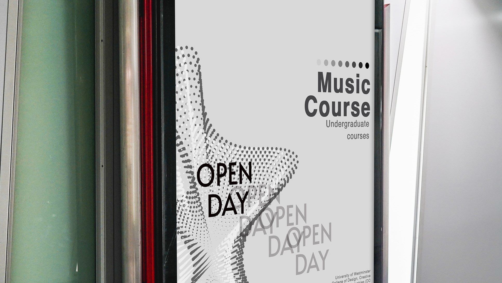
This project was made during my second year of university. The task was to make a magazine in InDesign. This project is about exploring typefaces, practicing with
with the text and using hierarchy in pages, choosing the right colour scheme, size. As well as that, we have to individually show exercises with text kerning, tracking and leading. We have to choose one Serif and one Sans-Serif typeface and I chose Helvetica and Times New Roman, two very useful and successful typefaces. This project helped me to compare the 2 different fonts and make decisions on what type works better for specific things. Here are a few pages from my work.
with the text and using hierarchy in pages, choosing the right colour scheme, size. As well as that, we have to individually show exercises with text kerning, tracking and leading. We have to choose one Serif and one Sans-Serif typeface and I chose Helvetica and Times New Roman, two very useful and successful typefaces. This project helped me to compare the 2 different fonts and make decisions on what type works better for specific things. Here are a few pages from my work.
